Log 008: Big Summer Glow-Up
Greetings, Vaniacs! Last devlog (a while ago, I know; sorry about that) we introduced you to our very first gameplay trailer in time for GDC earlier this year. That was a pretty exciting thing to have done, even though we didn’t have a booth or anything at the event itself. There’s something very “real” about working on something like trailers for your project.
Of course, since then our Number One Guy Robin has been back to juggling the dayjob with a major game release for Valheim (no spoilers but it was pretty hot!) and the rest of the team has had other life stuff to contend with as well. Van-14 is a part-time project, after all. You’d be forgiven for thinking that it’s taken a backseat for the moment - but you’d be wrong in thinking no progress has been made.
In fact, quite a lot has been implemented, and many things iterated upon. A big choice we’ve been considering for a long time now was regarding the art style. While we all love the grittier, old-school style of the original semi-pixel style, we needed to face the fact that, with Robin bearing the sole burden of that artwork, it wasn’t as sustainable as we’d like. We decided to lean properly into his strengths and switch it up a little to make production swifter and easier. Fear not: we haven’t gone super-modern and polished. We’re pretty confident that you’ll still enjoy the new version:
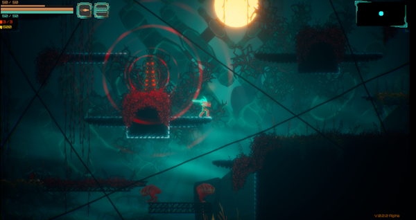
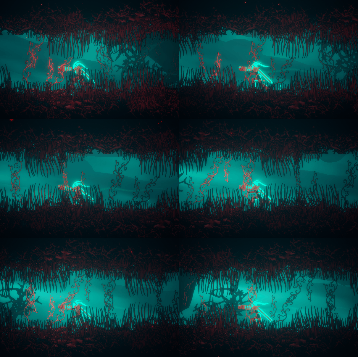
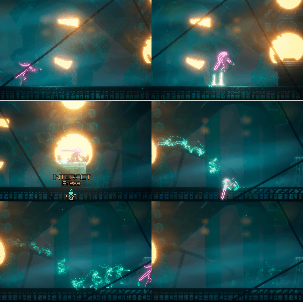
Technically Van is now 3D, which makes animating and iterating a lot simpler on Robin’s end. It’s allowed us to add in some new mechanics, effects, and even weapons that were previously going to be too time-consuming. It also means that our backgrounds (and foregrounds!) are much more dynamic. The stagnant caves of Coria and the overgrown Red Burrows now feel alive in a way we’d been hoping to achieve since production began.
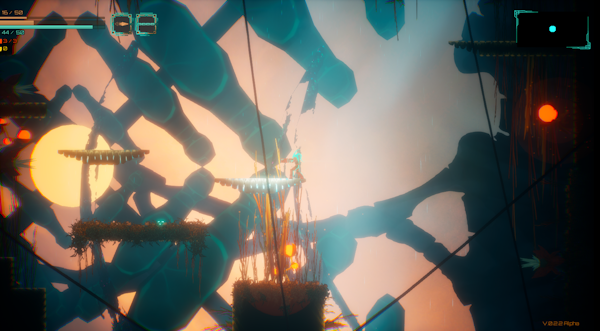
The UI has also been getting a progressive overhaul. Iconography has been refined and simplified; menus are in the process of receiving the same treatment, improving look and readability. As with all parts of the game this is still a work in progress, but progress is moving ahead well. There are a lot of things to consider with UI design, like how future localisation will fit with the schema, how it will read in different resolutions, etc. Getting a solid foundation down is key to preparing for those future challenges.
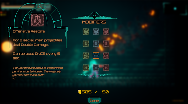
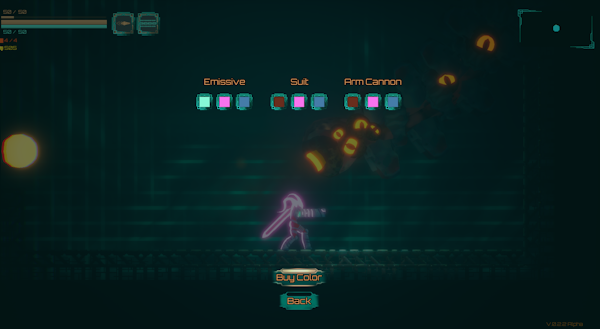
There are many such challenges to prepare for, and work to be done to overcome them. Trying to do everything justice while keeping within the project’s scope is a challenge in and of itself, and one we constantly keep in mind as we work towards our next testable release: a proper demo, with all major systems implemented. That’s our current year-end goal, and one we’re (fingers crossed) on track to achieve. As we progress towards that you can expect updates detailing some more of the mechanic changes and additions we’ve been working on; we’ve love to hear your feedback on them. And as always you can keep up with the project here, or over on our Discord server for hi-res images and casual chat.
See you next devlog,
The Van-14 Dev Team
Van-14
Metroidvania loveletter
| Status | In development |
| Authors | Wicked Cherry, erikantgame |
| Genre | Action, Platformer |
| Tags | 2D, Metroidvania, Pixel Art, Retro, Side Scroller |
More posts
- Log 007: Trailer, ParkedMar 20, 2024
- PSA: Systems ClearFeb 10, 2024
- PSA: Security ProtocolJan 30, 2024
- Log 006: The Gift of FriendshipDec 25, 2023
- Log 005: Coria CallingOct 10, 2023
- Log 004: Omelette you guessSep 06, 2023
- Log 003: Upgrading the UpgradesAug 22, 2023
- Log 002: Lights + Camera = Action!Aug 08, 2023
- Log 001: A little Alpha updateJul 25, 2023

Comments
Log in with itch.io to leave a comment.
nice